Meditrack - A Web Experience |
Meditrack - A Web Experience |
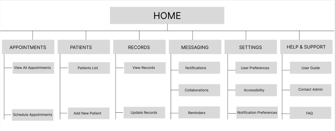
Kicking Things Off With A Site Map…
To begin the MediTrack UX process, I created a comprehensive site map to establish a clear structure for the platform. This initial step helped define the core pages, user pathways, and primary features, ensuring a logical and user-friendly navigation flow. By outlining the relationships between different sections—such as Appointments, Patient Records, Messaging, and Collaboration—I was able to visualize the overall architecture and identify potential friction points early on. The site map served as a strategic foundation for aligning user needs with business goals, guiding design decisions throughout the project, and ensuring that each feature was placed with purpose and clarity.
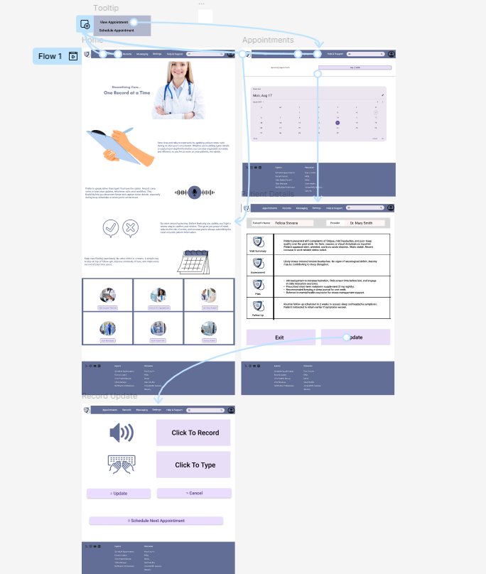
I created a low-fidelity prototype to bring the layout and user flow to life digitally. This prototype focused on structure and functionality rather than visual design, allowing me to test how users would navigate core features like viewing appointments, updating patient records, and recording notes. It was instrumental in identifying gaps in the workflow and making quick adjustments before investing time in high-fidelity visuals. By simulating key interactions in Figma, I ensured that the design remained intuitive, efficient, and aligned with user needs—laying a solid foundation for further usability testing and visual refinement.
With the core structure validated through the low-fidelity prototype, I moved on to developing high-fidelity mockups that brought the MediTrack interface to life. These mockups incorporated brand colors, typography, iconography, and spacing to create a clean, professional look tailored for medical professionals. I paid close attention to visual hierarchy and accessibility, ensuring that essential actions were easy to locate and perform. This stage helped stakeholders visualize the final product and provided developers with a detailed blueprint for implementation, while still centering the intuitive experience and user-first approach that guided the entire design process.
Moving On To The Mockups…
A Hi-Fi Prototype To Round Off.
With the visual design elements refined, I developed the high-fidelity prototype to demonstrate how MediTrack would function in a real-world setting. This clickable prototype allowed for a realistic simulation of user interactions, showcasing the app’s intuitive navigation, clear layout, and streamlined workflows designed specifically for doctors managing patient updates and appointments efficiently. It served as the final validation before handoff to developers.
Then a Lo-Fi Prototype…
MediTrack was designed with doctors in mind, simplifying patient management while enhancing workflow efficiency. This project reinforced my commitment to creating user-centered solutions that balance functionality with intuitive design.
Welcome.
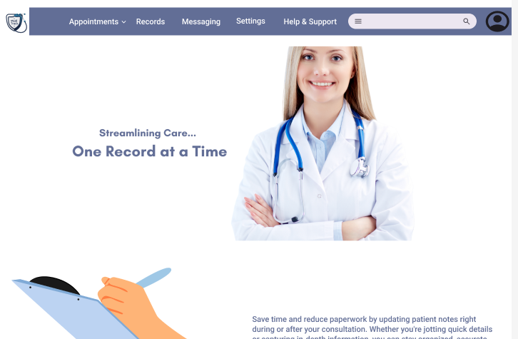
In addition to the app, the team and I got to work crafting a responsive MediTrack Website as well.
Let’s check it out.