MediTrack - A Case Study |
MediTrack - A Case Study |
The Duration:
The project was completed over a 4-week period, including research, wireframing, prototyping, and usability testing.
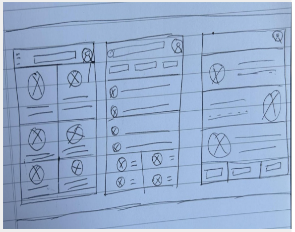
Paper Wireframe
In creating these paper wireframes, my goal was to prioritize usability, clarity, and workflow efficiency for healthcare professionals. I explored three layout variations to test how best to balance quick access to critical patient information with intuitive navigation.
My Responsibilities:
UX Designer | UX Researcher | UX Writer
Responsibilities include, user research, wireframing, prototyping and writing.
To understand the documentation challenges faced by healthcare professionals, I conducted qualitative user research, including interviews with two family physicians and one registered nurse at a local primary care clinic.
Initially, I assumed that most frustrations stemmed from outdated technology alone. However, through these conversations, I discovered that poor cross-device usability, fragmented workflows between nurses and doctors, and lack of mobile access were equally significant pain points. The research revealed that users prioritized real-time access, intuitive navigation, and seamless collaboration features. These insights shifted my design focus from simply modernizing the interface to rethinking the entire documentation experience around workflow integration.
1
Doctors and nurses spend too much time navigating through multiple tabs and forms just to complete basic patient documentation, which disrupts their workflow.
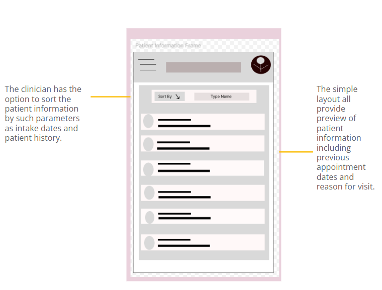
Digital Wireframes
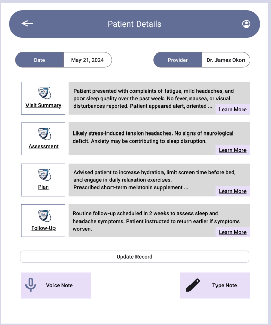
For the patient information page, I designed with clarity and speed in mind. The wireframe uses a tabbed layout to organize medical history, notes, vitals, medications, and labs, ensuring minimal scrolling and easy access to critical data.
Hi, thank you for dropping by.
Company says, “We cannot build a patient tracking app that holds thousands of records without it getting too clunky.”
I say, “Hold my b…” How about I stop here?
Allow me to take you on a journey. A user journey, that is. From user research and almost comically bad paper wireframes to digital wireframes and a hi-fi prototype, I’m excited to show them all to you.
Ready?
The Mission:
This project involved designing a responsive web and mobile app that enables primary care doctors and nurses to efficiently document, store, and access patient records. The goal was to create an intuitive, user-centered interface that supports real-time collaboration and streamlines clinical workflows.
The Problem
Primary care providers often struggle with fragmented, outdated systems that make documenting and accessing patient records time-consuming and error-prone. This disrupts clinical workflows, reduces efficiency, and increases the risk of miscommunication between care teams.
User Research | Personas | Problem Statements | User Journey Maps
User Research - Summary
2
The current system isn’t optimized for mobile use, making it difficult for providers to access or update records during home visits or while on the move.
Problem Statement
Dr. Maria is a Medical Doctor who needs a fast, intuitive way to document and access patient records across devices because inefficient systems slow her down, disrupt patient care, and increase her after-hours workload.
3
Mockups | Hi-Fi Prototype
MediTrack was designed with doctors in mind, simplifying patient management while enhancing workflow efficiency. This project reinforced my commitment to creating user-centered solutions that balance functionality with intuitive design.
Nurses and doctors often use different tools or paper-based notes, leading to communication gaps and incomplete or delayed updates to patient records.
4

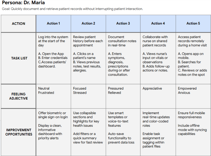
User Journey Map
In designing this user journey map, my goal was to deeply understand and visualize Dr. Maria’s real-world interactions with the product. I focused on key tasks that reflect her daily workflow, from logging in to documenting patient care on the go. By mapping her thoughts, emotions, and pain points, I was able to identify opportunities where the product could meaningfully reduce friction and enhance her efficiency. This process helped me prioritize user-centered design features that align with both the fast-paced nature of healthcare and the need for intuitive, time-saving digital tools.
End-of-day documentation piles up due to inefficient systems, contributing to clinician burnout and reducing time available for direct patient care.
Paper Wireframe | Digital Wireframe | Lo-Fi Prototype | Usability Study
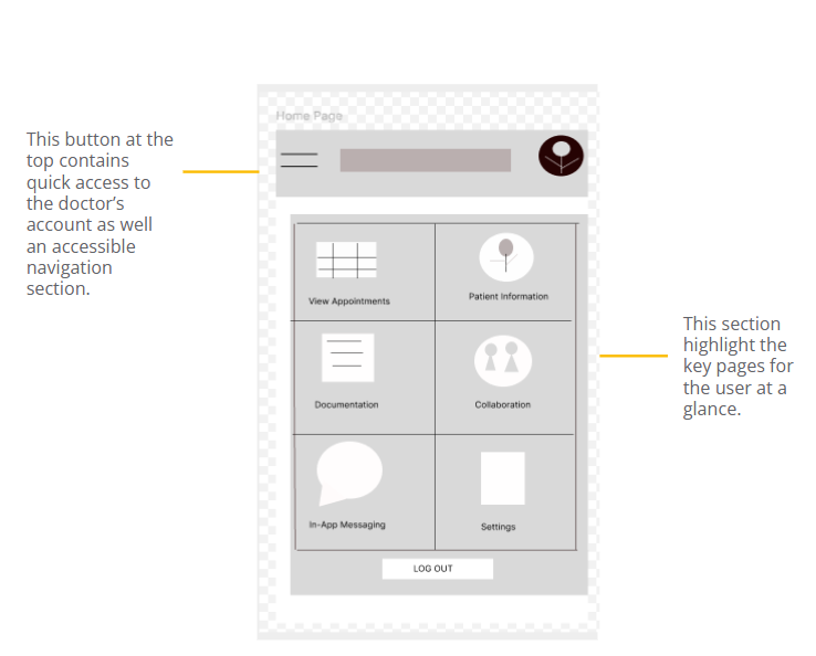
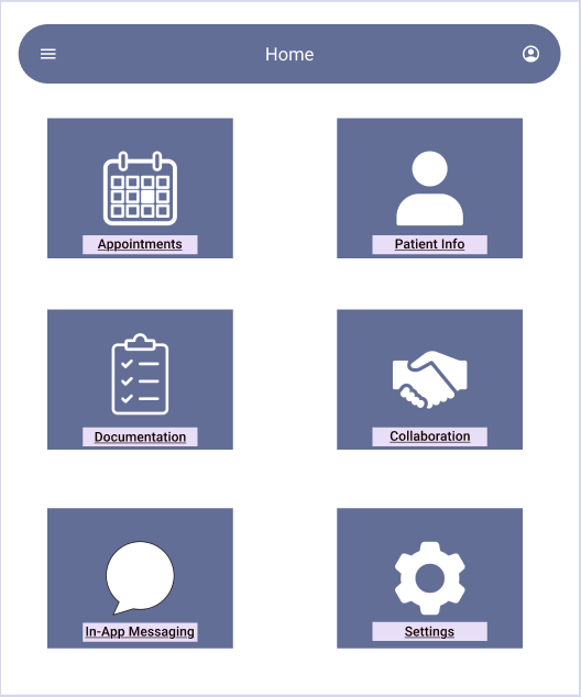
Digital Wireframes
For the homepage/dashboard wireframe, my focus was on creating a clean, glanceable interface that gives clinicians immediate access to key information such as upcoming appointments, patient information, and in-app messaging.
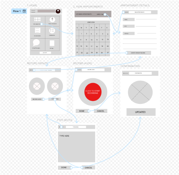
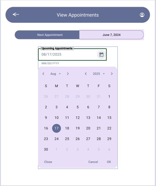
Low-Fidelity Prototype
For this prototype, I focused on mapping out the critical task of viewing and documenting patient appointment. The user journey begins with the “View Appointments” screen, followed by selecting a specific date to display scheduled patients. From there, users can review or update a patient’s record, with the option to either record audio notes or type them manually. Depending on the method selected, the user is directed to a tailored page for documentation, culminating in a confirmation screen to ensure the entry is saved successfully. This linear, choice-driven structure helps streamline note-taking while giving users flexibility and control based on their preferred input method.
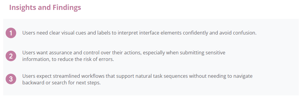
Usability Findings
To evaluate the usability and effectiveness of the low-fidelity prototype, I conducted moderated usability tests with a small group of clinicians, including both doctors and nurses. Participants were asked to complete core tasks such as viewing appointments, updating patient records, and navigating through the documentation flow. The goal was to observe how intuitive the interface felt and identify areas where users encountered confusion or hesitation.
Hi Fidelity Prototype